|
-
Tartan ID (Old B&W Photo)
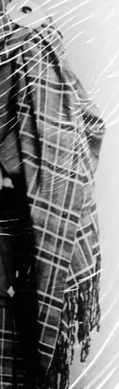
This may be a long shot, but my Uncle is hoping to be able to identify this tartan. There are, unfortunately, no color pictures available. I wasn't sure if it would be possible to identify it by the Sett, but I figured if anyone could, it would be someone here.
Thank you in advance for any insight you might be able to provide! If it's not possible I'll pass that on to him.
-
-
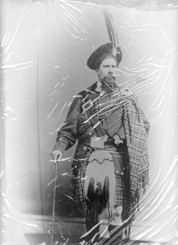
I have the full picture now. Thought I would add it in case it helps. 
There is little known about him other than that the family name was Anderson. The tartan doesn't seem to match the Anderson tartans I'm seeing online though.
Anyway, that's the new info I've gotten today, and thanks in advance if anyone has any insight.
-
-
At first glance, it appears Wilson's Pattern No. 148 or 'Douglas', although the colourway may be different than that tabulated by Logan in 1831.
However, there is something in the setting, about half way down the Plaid, which leaves me to reconsider.
Ryan
Last edited by Domehead; 2nd July 14 at 07:24 PM.
-
-
This is a tricky one, partly because of the relatively poor quality of the image and also because the interpretation of colours in B&W is not always straight forward. In attempting to identify it one first needs to describe (break down) the sett. So what does the picture tell us?
1. The sett is symmetrical.
2. It is a fairly simple design.
3. The setting is large.
4. One pivot is a large plain ground which is bordered by a dark band with light stripe on either side. Here's a tidied up section showing both pivots.

5. The other has a pale overstripe, possibly with black guards. Here's that section.

Even tidied up the sett is still difficult to work out with certainty but is certainly very close these two: Perth/Drummond of Perth or possibly
Spens.
Whether it was one of these we will probably never know although a hi-res copy of the original picture may allow better interpretation.
-
-
Thanks Mr. MacDonald,
It was that "pivot [on] a large plain ground..." which caused me to reconsider Pattern No.148.
In your second image, the "white" guard stripes to the dark sprainge which flank every pivot, seems difficult to mesh with Perth/Drummond of Perth or Spens.
But, as you stated, B&W imagery or, even Sepia Tone, depended highly on chemical bath for exposure. I have a chart which allowed for interpretation of the colours
in these types of images. When I return from work I will post it for anyone.
Thanks again,
Ryan
-
-
 Originally Posted by Domehead

In your second image, the "white" guard stripes to the dark sprainge which flank every pivot, seems difficult to mesh with Perth/Drummond of Perth or Spens.
I don't know, looks pretty close to Spens to me?
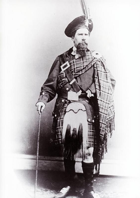
Extract from photo

Spens in mono tones

-
-
Aye, right,
In colour, the eye clearly defines the ground and the "Stewartesque" pattern. In B&W, I was focused on defining the repeat, as if it were code. I clearly see your point, as well as that of the Perth/Drummond of Perth. One may argue the yellow sprainge of that sett would expose differently from Spens, which seems exactly what you've suggested.
By the way, here is the colour-to-monotone chart I use when determining football shirt number colours from old programmes. I cropped it off the internet a while back.
For the MODS, I truly don't remember the site. It was a photography oriented site and this was an item / example used to determine proper exposure. The manufacturer icons are all present on the tablets. I hope everyone understands.

P.S. The image is included in the article: Paynter, Herb "Shedding Light On Black & White Part 3: The Digital Conversion", The Way Eye Sees It, www.thewayeyeseesit.com 13 JUL, 2013
Last edited by Domehead; 3rd July 14 at 11:58 AM.
-
-
Hey guys, thank you very much for your help. I did ask today if it would be possible to get a higher quality scan and I received one that's much better.
That article is great, I'm going to pass that on to my husband. He does a bit of photography and photo editing. He was looking for something of this nature last night, wondering if it might be possible to colorize the photo at all.
-
-
Thank you. Unfortunately it is still too indistinct to allow more detailed investigation. I have no idea if the image could be coloured up but if it could it would be a considerable amount of work and I doubt would ever be able to replicate the halftone subtleties of tartan that a true colour photograph would show.
-
-
4th July 14, 06:27 AM
#10
Thank you very much for the time you spent trying to figure it out, it is definitely much appreciated.
-
 Posting Permissions
- You may not post new threads
- You may not post replies
- You may not post attachments
- You may not edit your posts
-
Forum Rules
|
|


Bookmarks