|
-
15th February 15, 02:11 AM
#31
Thanks 'Wiz. I think the tartan would be popular if put on the market. I can't swing it now, but maybe someone will. There are many yards of tartan on the shelves here already.I've got a huge negative cash flow problem when it comes to that. hate to think of what might be in store if I were to become a purveyor of tartan.
-
-
22nd February 15, 07:53 AM
#32
There's something I can't put my finger on that's not "tartanlike" about that design. I ran into the same thing trying to design a Cornish tartan. It comes from being boxed in by the symbols we're incorporating; you can't serve two masters! And the most beautiful tartans seem to be the ones designed without such restrictions, and being guided only by purely artistic merit.
Here's my mostly ghastly attempts at a more attractive Cornish tartan. Like the 13 red and white stripes and 50 white stars on a blue ground which a USA flag tartan might want to show, I was attempting to somehow capture both the St Piran flag and the 15 bezants
http://www.xmarksthescot.com/forum/f...oncepts-59588/
I didn't like any of my efforts, but finally I feel I had a breakthrough and designed this Cornish tartan, with the St Piran flag and the Bezants but still looking like wool fabric (form follows function)

The American tartan designed by, I think, James Scarlett? is very nice. However my favourite is the one that abandons sticking to only red/white/blue in equal portions and has a dark ground. Here it is. I think that loosening up on the strict flag-colour thing and striving to look like an attractive fabric is what makes it work for me.

These colours seem too computer-generated-like for me. The actual fabric is much nicer.

I've looked at Benning Boy's tartan more and I think what doesn't work for me is, how to say it? A lack of integration, or organic-ness of the overall design? I don't know how to word it, but it's like the red/white portion is from a piece of separate fabric that's been applied.
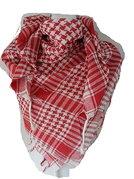
That red/white section brings to mind head-scarves for some reason. It's a daunting design challenge! If you're stuck with red and white equal stripes, how are you to avoid that effect?

This tartan, American Bicentennial, avoids that effect, and creates more integration, by making the red and white stripes unequal for a more tartanlike look, also the dark stripes help anchor the design and give the tartan more gravitas

What comes to mind is Anderson, which also has a busy/crowded portion of fine lines, but somehow makes it look OK

(Note in both the tartans above the central red stripe is wider than the flanking ones, avoided the visual tedium of an unbroken sequence of evenness. In addition, the ground-colour alternates underneath the red lines in Anderson. Still, I agree with Scarlett that Anderson isn't entirely successful as a design.)
Have you tried using more than one shade of blue? That can be very effective, and give a smoother, more integrated, more clothlike effect. Isle Of Skye has three shades of green.
OK I just took a quick stab at your design issue. Here it is. Not enough stripes, but perhaps it gets across what I was finding difficult to put into words about breaking up the evenness of the stripes, following traditional proportions, and striving for more integration.
CAVEAT: I sometimes forget that, as an Art Major, I am used to the free exchange of ideas about works of art/designs with no offense intended or taken... indeed the bulk of our classes were 'critique' classes, 'criticism' in the pure sense of the word. I hope everyone takes my comments in that spirit.
Anyhow a quick stab at the design problem; the wider red at the borders of the red/white area allow a smoother transition for the eye to the blue ground, for a more integrated look.

OK here's the correct number of red and white stripes. Why not make them equal? They're equal in the flag! My response would simply be that a kilt is not a flag, that tartans have their own visual vocabulary ruled by traditional proportions and motifs. People too often forget that tartan is fabric first and foremost, and not a diagram.
Anyhow to my eye this is more clothlike and integrated (in other words not pasted together from disparate elements). To my eye either of these last two designs are more pleasing, in regards to the arrangement of the fine lines, than the American Bicentennial above, in which the fine lines appear squished together.

Last edited by OC Richard; 23rd February 15 at 07:36 AM.
Proud Mountaineer from the Highlands of West Virginia; son of the Revolution and Civil War; first Europeans on the Guyandotte
-
-
27th February 15, 02:21 AM
#33
Wow, Richard, now I see why you have such an eye. You have been training it for years!
You are right about remembering that this is meant to be used for fabric first and foremost - we aren't strapping on flags. We have to remember the flag is just the inspiration. When you let the proportions of each colour help dictate the balance, then you get a pattern that is much more visually stimulating and therefore more like a tartan.
A picture is worth a thousand words, but the addition of a few well placed words can make the pictures priceless. Thank you for 'playing' with your computer and showing us what we needed to understand.
-
-
7th March 15, 07:09 PM
#34
Robertson hunting is a beautiful tartan but it is also very common in rental outfits, at least in Scotland. The first three times I wore a kilt it was a Robertson hunting from a rental shop.
Popularity sometimes breeds contempt, and if you ever wear your Robertson hunting in Perth, the locals will think you rented it.
-
 Posting Permissions
- You may not post new threads
- You may not post replies
- You may not post attachments
- You may not edit your posts
-
Forum Rules
|
|


Bookmarks