|
-
29th August 17, 03:13 PM
#11
Not a problem at all, I think we have all called any non-Tartan kilt a Utilikilt at one time or other.
Steve Ashton
www.freedomkilts.com
Skype (webcam enabled) thewizardofbc
I wear the kilt because: Swish + Swagger = Swoon.
-
-
29th August 17, 05:23 PM
#12
The fabric is vibrant for sure. My guess is there will be folks that will envision and consign vests, jackets, ties, shirts, slacks, wraps, etc., before they will think of kilts mainly because of the fabric itself (made of wool or not). I agree the pleating options are endless and ten people could make ten different kilts (each unique) with this material.
Too flashy for me but I like the design.
-
The Following User Says 'Aye' to Tarheel For This Useful Post:
-
30th August 17, 08:13 AM
#13
 Originally Posted by WalesLax

I think it is a great idea, but as others have stated, this isn't the look I would have anticipated. On the register, it states"...his tartan is based on the New York City tartan and incorporates the variety of bright colours used to identify that movement around the world." I would like to have heard more about those colors and their meanings. I'm always intrigued by the "why's" and the connections
https://en.wikipedia.org/wiki/Stonewall_riots
https://en.wikipedia.org/wiki/Rainbo...LGBT_movement)
At the time of the raid, my time at the Federal Reserve was near its end, and I segued into theater through a friend from Honors Programs
I hadn't seen since high school. That led to being the only straight guy in a play which involved the first male/male kiss seen on an Atlanta
stage. We got death threats. We went on anyway. Nobody died, but we were closed to standing room only houses after a highly acclaimed
short run at the premier theater in the city. It provided a real eye-opener of an education on systematic discrimination and abuse most had
not encountered. Coming so close on the heels of the civil rights movement and framed by the feelings around our presence overseas, the
police raid triggered an explosive exposure of the abuse of power on that portion of society. I have brave friends on all sides of all those issues,
so no position taken to create dissension. Just responding to history and color question.
Last edited by tripleblessed; 30th August 17 at 08:14 AM.
-
-
30th August 17, 09:39 AM
#14
I understand both the fight for rights in NYC (and around the world) and the rainbow flag, but some writeups go further into depth on the colors and sizing of each. I guess I was hoping for more explaination into the meaning than "we recolored the NYC tartan with the rainbow colors," but if that is all there is to it, that works.
Rob
-
-
30th August 17, 12:06 PM
#15
As the Pride of LGBT Tartan was designed by Brian Wilton of The Scottish Tartans Authority perhaps we should ask him. He is a member here. His username is "Tartanman".
-
The Following User Says 'Aye' to Steve Ashton For This Useful Post:
-
30th August 17, 07:08 PM
#16
Originally Posted by Steve Ashton
As the Pride of LGBT Tartan was designed by Brian Wilton of The Scottish Tartans Authority perhaps we should ask him. He is a member here. His username is "Tartanman".
I did not realize he was a member here - very cool! I'll try to find him and ask. Thanks for the heads up,
Rob
-
-
30th August 17, 11:49 PM
#17
Originally Posted by Steve Ashton
As the Pride of LGBT Tartan was designed by Brian Wilton of The Scottish Tartans Authority perhaps we should ask him. He is a member here. His username is "Tartanman".
Just a point of correction, Brian retired from, and is no longer involved with, the STA other than being a member.
-
The Following User Says 'Aye' to figheadair For This Useful Post:
-
31st August 17, 04:21 AM
#18
About the tartan linked to in the OP, to myself as an artist the design is challenging.
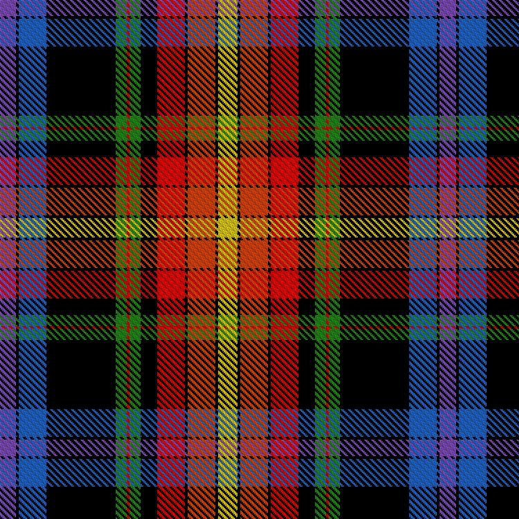
It has perhaps too much going on, or perhaps better to say that the two main sections, warm and cool (orange/yellow and blue/purple) don't feel integrated into the whole. I've identified what challenges my eye, it's the offset green stripe on the black. The colour-juxtaposition feels jarring and the fact that the green is pushed to one side somehow doesn't feel right. And this section is what's keeping the red/yellow and blue/purple sections from integrating.
Yet it has a strength to it, and (to my eye, Peter would be a better judge) it has an "old" feel about it, that slightly over-the-top look of some early tartans, overly busy with loads of colour relationships going on.
The decision to put all those colour-groups on a black ground gives the tartan depth and gravitas, yet feels odd in a way.
Had I come across this tartan in a vacuum I don't think I would have got the rainbow reference.
In any case I think it's a far more traditional-looking and successful design than the other ones shown in this thread. Trying to design a successful clothlike tartan around the colour-spectrum is extremely difficult in my opinion, perhaps impossible.
The Declaration tartan does some of the same things (red & orange area on a cool background) with a greatly reduced black underpinning and despite being borderline-garish I feel it works as a design.

The bottom line is that tartan and flags are two different art-forms, and trying to design a tartan based on a flag is going to be inherently difficult. It's an endeavour which to me is a bit misguided- if you want a flag-kilt, wear a kilt made out of a flag. It's been done.
Last edited by OC Richard; 31st August 17 at 04:46 AM.
Proud Mountaineer from the Highlands of West Virginia; son of the Revolution and Civil War; first Europeans on the Guyandotte
-
The Following 2 Users say 'Aye' to OC Richard For This Useful Post:
-
31st August 17, 06:34 AM
#19
Originally Posted by OC Richard
It has perhaps too much going on, or perhaps better to say that the two main sections, warm and cool (orange/yellow and blue/purple) don't feel integrated into the whole. I've identified what challenges my eye, it's the offset green stripe on the black. The colour-juxtaposition feels jarring and the fact that the green is pushed to one side somehow doesn't feel right. And this section is what's keeping the red/yellow and blue/purple sections from integrating.
Yet it has a strength to it, and (to my eye, Peter would be a better judge) it has an "old" feel about it, that slightly over-the-top look of some early tartans, overly busy with loads of colour relationships going on.
Richard, you are right about it having the feel of some of the old patterns, generally the later 18th century Wilsons' type setts but a couple of earlier patterns too. Two things stand out for me and which I would have done differently; firstly, the shades don't appeal to me, I'd have gone with a mossier green and a darker blue. Secondly, I'm not a fan of the proportions; I'd prefer to see a narrower yellow stripe and broader blue bars with possibly narrower broad blacks. That said, I don't know wat the design brief was and each of us has personal preferences as to colour, shade and proportions.
-
-
4th September 17, 09:59 AM
#20
Originally Posted by Steve Ashton
As the Pride of LGBT Tartan was designed by Brian Wilton of The Scottish Tartans Authority perhaps we should ask him. He is a member here. His username is "Tartanman".
Just a quick follow up - I did reach out and haven't gotten a response. I don't need one or anything, but at least I hope he sees my compliment on his work and that there is some interest in what he designed.
I would still love to see this as a kilt and some of the pleating options, though I don't think I'd ever buy it. I showed it to some gay friends who thought similarly, but they are also the kind of guys who don't like "rainbow for rainbow's sake."
-
The Following 2 Users say 'Aye' to WalesLax For This Useful Post:
 Posting Permissions
- You may not post new threads
- You may not post replies
- You may not post attachments
- You may not edit your posts
-
Forum Rules
|
|


Bookmarks