About the tartan linked to in the OP, to myself as an artist the design is challenging.
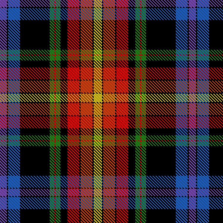
It has perhaps too much going on, or perhaps better to say that the two main sections, warm and cool (orange/yellow and blue/purple) don't feel integrated into the whole. I've identified what challenges my eye, it's the offset green stripe on the black. The colour-juxtaposition feels jarring and the fact that the green is pushed to one side somehow doesn't feel right. And this section is what's keeping the red/yellow and blue/purple sections from integrating.
Yet it has a strength to it, and (to my eye, Peter would be a better judge) it has an "old" feel about it, that slightly over-the-top look of some early tartans, overly busy with loads of colour relationships going on.
The decision to put all those colour-groups on a black ground gives the tartan depth and gravitas, yet feels odd in a way.
Had I come across this tartan in a vacuum I don't think I would have got the rainbow reference.
In any case I think it's a far more traditional-looking and successful design than the other ones shown in this thread. Trying to design a successful clothlike tartan around the colour-spectrum is extremely difficult in my opinion, perhaps impossible.
The Declaration tartan does some of the same things (red & orange area on a cool background) with a greatly reduced black underpinning and despite being borderline-garish I feel it works as a design.

The bottom line is that tartan and flags are two different art-forms, and trying to design a tartan based on a flag is going to be inherently difficult. It's an endeavour which to me is a bit misguided- if you want a flag-kilt, wear a kilt made out of a flag. It's been done.
Last edited by OC Richard; 31st August 17 at 04:46 AM.
Proud Mountaineer from the Highlands of West Virginia; son of the Revolution and Civil War; first Europeans on the Guyandotte


Bookmarks