


Last month there were a couple of threads where people put forth the request for a patch of or badge that we X Markers could use to identify each other.
I promised to post pics of the Embroidered X Marks Clan Crest patch I was doing.
CAUTION: This has not been approved by Hank!!!!
I just wanted to post these so you guys could make rude comments.
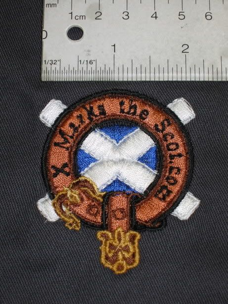
The raw crest as it comes out of the machine with the backing cloth still on it.
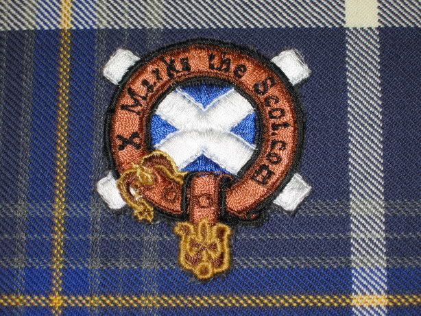
The crest trimmed and on the X Marks Tartan.


Bookmarks