|
-
4th September 15, 09:28 AM
#11
While my eye was drawn to the second, initially..have to admit that the first gradually became more appealing for its subtlety.
-
-
4th September 15, 09:32 AM
#12
If this works, you'll be able to see them both together.
The threadcounts are identical, just can decide between the pink-purple placement
Stìophan, Clann Mhic Leòid na Hearadh
Steven, Clan MacLeod of Harris
Dandelion Pursuivant of Arms
-
The Following 2 Users say 'Aye' to saharris For This Useful Post:
-
4th September 15, 10:39 AM
#13
Very smart. Definitely #2 for me.
-
-
4th September 15, 08:19 PM
#14
The second has already been seconded, so let me second all the seconds for the second...for just a second
 Originally Posted by Alan H

Some days you're the bat, some days you're the watermelon.
-
The Following 2 Users say 'Aye' to Mikilt For This Useful Post:
-
5th September 15, 04:37 PM
#15
I find both attractive, but what popped immediately into my mind on seeing them was "Cape Breton tartan". Obviously the colours in the lines are different, but the similarity to the CB tartan (one of my favourites, incidentally) is striking, especially in the second version. For that reason, I would prefer the first one, as being not quite so close to the CB tartan.
Last edited by imrichmond; 5th September 15 at 04:38 PM.
-
The Following User Says 'Aye' to imrichmond For This Useful Post:
-
6th September 15, 10:08 AM
#16
I'm not overly concerned about similarity to the Cape Breton district tartan. I'm sure every tartan is "similar" to some other tartan somewhere.
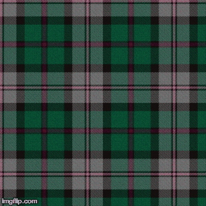
The pink-over-green was the first one the I designed. I was going for the most contrast in the design, by putting the light pink on the dark green, and the dark purple on the light gray. However, I'm afraid that the higher contrast makes pink a bit jarring.
In the second design, but putting the light pink on the light gray, I feel that the pink is less jarring. Subtlety has its merits.
Last edited by saharris; 6th September 15 at 11:05 AM.
Stìophan, Clann Mhic Leòid na Hearadh
Steven, Clan MacLeod of Harris
Dandelion Pursuivant of Arms
-
The Following User Says 'Aye' to saharris For This Useful Post:
-
8th September 15, 05:42 PM
#17
Normally I would like the higher contrast, but there's something about the purple-on-green and pink-on-gray that I like.
Here's tae us - / Wha's like us - / Damn few - / And they're a' deid - /
Mair's the pity!
-
-
9th September 15, 06:57 AM
#18
Wilsons of Bannockburn information
Hope this provides a bit of an insight into Wilsons of Bannockburn and their legacy. I think this quote sums it up fairly well
"The Wilson weaving firm was known during the period of 1765 - 1924 to have searched the Highlands for old patterns, then re-introduced them under names of their choosing if the original clan or district could not be determined.'
http://www.tartansauthority.com/rese...ilson-and-son/
-
-
17th September 15, 05:09 AM
#19
Originally Posted by saharris
I

For me this one too. The proportions are quite pleasing, as is the distribution of colours.
However speaking in purely graphic design terms (and not as a weaver) I will say that for me the pink stripe in the middle of the green ground, due to the thick dark borders, looks too heavy/contrast-y and I find my eye drawn to it too much. This is a very subtle thing, I'm talking fine points here. It can happen, when you juxtapose the lightest and darkest colours in a tartan, that that area jumps out to the eye as being overly contrast-y. To knock down that effect you can reduce width and introduce other colours (in this case the ground-colour) in between.
Ideally, in design terms, one wants the eye to pass smoothly over a design, and not be arrested by any part standing in too much contrast to the rest. In other words a design is best if it has an overall balance.
I think to make that area stand out less, and integrate into the green ground more, you could introduce narrow green lines between the pink and the bordering black stripes, like below. The change reduces the contrast and heaviness of the black/pink/black area to the point where it's just about the right balance with what's happening in the grey area.
(My apologies, this was done very quickly and the colours and proportions aren't quite correct I know, but I wanted to demonstrate what I was talking about.)

Last edited by OC Richard; 17th September 15 at 05:50 AM.
Proud Mountaineer from the Highlands of West Virginia; son of the Revolution and Civil War; first Europeans on the Guyandotte
-
-
17th September 15, 11:03 AM
#20
Originally Posted by OC Richard
For me this one too. The proportions are quite pleasing, as is the distribution of colours.
However speaking in purely graphic design terms (and not as a weaver) I will say that for me the pink stripe in the middle of the green ground, due to the thick dark borders, looks too heavy/contrast-y and I find my eye drawn to it too much. This is a very subtle thing, I'm talking fine points here. It can happen, when you juxtapose the lightest and darkest colours in a tartan, that that area jumps out to the eye as being overly contrast-y. To knock down that effect you can reduce width and introduce other colours (in this case the ground-colour) in between.
Ideally, in design terms, one wants the eye to pass smoothly over a design, and not be arrested by any part standing in too much contrast to the rest. In other words a design is best if it has an overall balance.
I think to make that area stand out less, and integrate into the green ground more, you could introduce narrow green lines between the pink and the bordering black stripes, like below. The change reduces the contrast and heaviness of the black/pink/black area to the point where it's just about the right balance with what's happening in the grey area.
(My apologies, this was done very quickly and the colours and proportions aren't quite correct I know, but I wanted to demonstrate what I was talking about.)
Thanks for your thoughts!! I can appreciate what you are saying about the pink-on-green being a bit jarring. The high contrast between the dark green and the light pink does prevent the eye from passing smoothly over the design. As it stands now, for that very reason, I may actually be leaning towards the other design. The pink-on-grey version has a subtlety that is growing in appeal to me.
Stìophan, Clann Mhic Leòid na Hearadh
Steven, Clan MacLeod of Harris
Dandelion Pursuivant of Arms
-
 Posting Permissions
- You may not post new threads
- You may not post replies
- You may not post attachments
- You may not edit your posts
-
Forum Rules
|
|


Bookmarks