|
-
6th October 16, 05:32 AM
#11
 Originally Posted by Litany of the Highlands

complimenting the kilt, not contrasting it, when it comes to the other colours.
If I had a Royal Stewart kilt, I'd probably be looking at having ties/flashes be in claret/dark red/dark crimson, ivory, dark yellow/mustard, or maybe black. Not to compete with the kilt but to accentuate it.
I see that we're using the word "compliment" in opposite ways.
You're using it to mean matching the kilt's colours, matching the red, white, yellow, and black in Royal Stewart in your example.
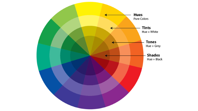
In art-speak "complimentary" has specific meaning. Complimentary colours are pairs of colours opposite on the Colour Wheel. Examples of complimentary colours are:
blue and orange
red and green
purple and yellow
In other words pairs of colours in complete opposition, as opposite as two colours can be, as far from matching each other as possible.
Thus my suggestion of Old Gold hose for a kilt with purple in it; those hose would compliment the kilt in the literal meaning of the word.
Another very effective thing with hose colour is to use what are called Analogous Colours, that is, colours side-by-side on the colour wheel.
My Isle of Skye kilt has no blue, no claret, but both hose colours look great. Why? They're analogous to the purple in the kilt. There's a colour-shift that happens with the eye that makes the kilt's colours more vibrant.
Having the accessories match the colours in a kilt tends to dull the tartan's colours, in effect drain the colour out of the kilt.
Originally Posted by Litany of the Highlands
all the groomsmen in grey granite tartan kilts, with matching grey Argyll jackets and 5 button waistcoats, white shirts, light grey sporrans and charcoal socks.
I'm not a fan of this current fad of grey tartans. That colourless outfit sounds visually just about as dull as possible. Highlanders have always loved colour!
For those not familiar with colours and how they work, here ya go!
Highlanders have always understood these concepts. Note that a very large number of tartans are based on the fundamental pair of complimentary colours red and green.
Another vast number of tartans are based on a pair of analogous colours, green and blue.
In Highland military uniform, green-based tartan paired with a red jacket is a clear case of following the principle of complimentary colour.

Complimentary colours in practice. The all-time master was Van Gogh

Tartan using only two complimentary colours

Last edited by OC Richard; 6th October 16 at 05:56 AM.
Proud Mountaineer from the Highlands of West Virginia; son of the Revolution and Civil War; first Europeans on the Guyandotte
-
The Following 2 Users say 'Aye' to OC Richard For This Useful Post:
-
6th October 16, 10:40 AM
#12
Originally Posted by OC Richard
I see that we're using the word "compliment" in opposite ways.
You're using it to mean matching the kilt's colours, matching the red, white, yellow, and black in Royal Stewart in your example.
In art-speak "complimentary" has specific meaning. Complimentary colours are pairs of colours opposite on the Colour Wheel. Examples of complimentary colours are:
blue and orange
red and green
purple and yellow
In other words pairs of colours in complete opposition, as opposite as two colours can be, as far from matching each other as possible.
Thus my suggestion of Old Gold hose for a kilt with purple in it; those hose would compliment the kilt in the literal meaning of the word.
Another very effective thing with hose colour is to use what are called Analogous Colours, that is, colours side-by-side on the colour wheel.
My Isle of Skye kilt has no blue, no claret, but both hose colours look great. Why? They're analogous to the purple in the kilt. There's a colour-shift that happens with the eye that makes the kilt's colours more vibrant.
Having the accessories match the colours in a kilt tends to dull the tartan's colours, in effect drain the colour out of the kilt.
Good point, I forgot about the colour wheel definitions there, I guess in those terms I mean shades and tones, and analogous colours but not literally the exact same colour. So if I was going to build off the red in Royal Stewart for my hose, my initial thoughts would be to aim at dark red, or mustard not actually the same bright red colour of the kilt.
For what I'm thinking for my actual wedding kilt, I'm looking at using tints, tones and shades of the colours in my tartan, and of analogous colours. Hence, at least for now the navy, ancient blue, dark purple choices. I'll have it all with me in a few weeks, and I'll get it on with some pictures, and photoshop the colours to see if I should make some changes.
I'm not a fan of this current fad of grey tartans. That colourless outfit sounds visually just about as dull as possible. Highlanders have always loved colour!
I agree, I'm not likely to want it or wear it ever in my life. It looked good for a wedding taken in isolation, but didn't look that good for THCD, and was something one of my cousins suggested for me that I really didn't like, I felt it would not express me and my fiancee at all. Then again, they were the only people in grey jackets at their wedding, and there were maybe 70 odd other kilts there. Again, in Scotland, to my mind I can see why people go with it, it stands out from the potential myriad of other kilts & jackets that could appear. So I can understand on some level why it has emerged in Scotland at least.
-
-
6th October 16, 05:31 PM
#13
Complement vs compliment
I believe we are talking about colours that complement each other. A compliment is what we would give to a person who wears an outfit that is wearing an outfit that we find complementary.
"Good judgement comes from experience, and experience
well, that comes from poor judgement."
A. A. Milne
-
The Following 3 Users say 'Aye' to Liam For This Useful Post:
-
8th October 16, 03:14 AM
#14
This is a fascinating discussion and helps me understand why I've always felt that certain colour 'go together' and others do not.
Originally Posted by OC Richard
Highlanders have always understood these concepts. Note that a very large number of tartans are based on the fundamental pair of complimentary colours red and green.
Interesting that many tartans break the 'rule' that I grew up with that red and green should never be seen.
It is true that a great many tartans, including the vast majority of surviving 18th century specimems, feature red and green predominantly but to that mix I would add blue which often featured as the intervening colour around which the two ground colours were balanced.
In Highland military uniform, green-based tartan paired with a red jacket is a clear case of following the principle of complimentary
Whilst this is true in the majority of cases I think that that was more the result of economics rather than fashion. British military coats were red, principally because the colour stood out on the battlefield and allowed easy identification. I'm not sure that military tartans were chosen to 'compliment' the coats. Most setts were based on the 42nd sett which would have been much cheaper than opting for a red tartan which, if dyed with cochineal, would have been extremely expensive.
-
Tags for this Thread
 Posting Permissions
- You may not post new threads
- You may not post replies
- You may not post attachments
- You may not edit your posts
-
Forum Rules
|
|


Bookmarks