|
-
8th March 10, 11:45 AM
#1
I'm trying to get used to the new look (threw me off a little even though I knew it was coming... you know what I mean, almost felt lost like "wait, where do I find this link again?" sort of thing). Anyway, aside from having a little trouble reading the text, I've also noticed that on the right side where our User CP box is, I think our names used to be linked to our profile. I know I can access it by using the Quick Links drop down menu, but I like to have that easier link to click especially when I'm using my iPhone and need to get to my profile.
I've been checking the site out here and there on my laptop (Firefox) as well as my iPhone (Safari) and so far those are the only two biggies that are throwing me off the most (the text and the name/profile link). I'm sure the site is still being worked on here and there, so I won't really post too much unless I see a big error. I noticed one error earlier, but it seems to be corrected now.
I kind of miss the old look, but I'm willing to see how this one works out of course.
-
-
8th March 10, 12:02 PM
#2
 Originally Posted by Tobus

Is there a way for individual users to change the forum skin or theme? It should be an option if the admins have installed optional skins, but I don't seem to see a user panel for it.
there was but i just had a look and that option seems to have been taken away for some reason,
it was in setting and options part at the base.
most forums have dozens of skins and ive always been one for making a skin that's suits me rather than a basic skin that everyone's stuck with with my experience with forums most you can alter the writing background colours and tool bar options
i think folk should remember its not the pixels that make a forum what it is ....its the people in the forum that make it worth coming back too time and time again
Last edited by skauwt; 8th March 10 at 05:36 PM.
-
-
8th March 10, 12:16 PM
#3
Hmmm... looks like I'm the only one so far that likes the new layout!
I do have one niggle, though... there's no link at the bottom of the thread you're reading to take you back to whatever subforum you were on at the time. You need to either press the back button or scroll all the way back up to the top of the thread and click on the links there. 
-
-
8th March 10, 12:20 PM
#4
I don't hate the new layout or anything, it's really growing on me and there are aspects of it I like better than the old. My main critiques are more about reading/viewing and navigation. I see what you mean about the navigation links at the bottom of the thread. I hadn't noticed that yet, and it's also quite handy to have.
-
-
8th March 10, 02:18 PM
#5
Originally Posted by Stilletto_Rebel
Hmmm... looks like I'm the only one so far that likes the new layout!
I do have one niggle, though... there's no link at the bottom of the thread you're reading to take you back to whatever subforum you were on at the time. You need to either press the back button or scroll all the way back up to the top of the thread and click on the links there.
I'm with Stilleto. Bring back the link to the subforum at the bottom and I'm good to go. I do kinda miss the tartan background, but I'll get over it.
-Elliott
-
-
8th March 10, 12:49 PM
#6
is the advertising bar.....fitting in everybody's screen properly? the title bar doesn't fit very well for me, neither are the sponsors advertisements.
I'm not sure i like how white the page is now....
-
-
8th March 10, 01:56 PM
#7
I just wanted to add that I think there needs to be something on the right side of the top banner to balance it out - where the Scotweb banner used to be. Either that or taking the header image to the full width. Either way would work, it's just that right now the top space feels very unbalanced.
Also, having the User CP on the right of every page crowds it a bit, in my humble opinion. For example, reading someone's profile page, it feels like there's too much crammed in that page.
my $0.02
-
-
8th March 10, 02:15 PM
#8
I do miss the XMTS tartan border, but overall this look seems to work.
For any/all of you that are having a hard time dealing with this change, I highly recommend a book called "Who Moved My Cheese" by Spencer Johnson M.D. You may have heard of it. It is quite entertaining, and at the same time will help you in dealing with everchanging business, family, and even life in general.
"When I wear my Kilt, God looks down with pride and the Devil looks up with envy." --Unknown
Proud Chief of Clan Bacon. You know you want some!
-
-
8th March 10, 03:05 PM
#9
Why isn't the default text color BLACK?
light gray on white is awful. Awful.
And things aren't dynamically resized:
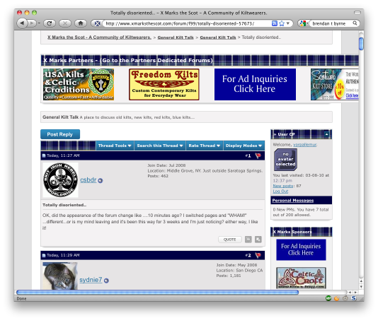
There are other layout problems, where things are drawn on top of each other.
And the stuff on the left side is a waste of space. Yes, I understand the idea is to sell more adverts. But there are better ways to do that, that don't result in huge amounts of white space.
-
-
8th March 10, 03:24 PM
#10
Well, the idea was not to sell more advertising space but to better utilize the space we have. If you remember, we had an ad for Kiva that took up one of the spaces in the top banner and the fourth space was a rotating Ad.
The way the module for the Ads was written was fine for the time when it was written but it was not suiting our current needs.
The new advertising plan allows me, with little to no programming skills, to easily change or modify Ads as needed. A Company can change their Logo and I can now update the site within moments.
The rotating ad we always a source of problems for the advertisers. The system was a double edged sword in that yes, we could have more advertisers and they would be able to be seen on the top banner but the more advertisers we had the less exposure each would get.
So all we have done is move what used to be the rotating Ads and placed them in a side banner. They are listed in alphabetical order and are visible on all pages at all times.
But the problem with the Top Logo Ad Banner stretching off the side of the page was not seen on my monitor, the Programmer's monitor nor on the seven other systems that the site was tested on.
Please believe me, we will be checking on this.
-
Similar Threads
-
By Alan H in forum Celtic Musicians
Replies: 26
Last Post: 1st June 08, 12:43 AM
-
By ozone in forum General Kilt Talk
Replies: 20
Last Post: 23rd April 07, 10:22 AM
 Posting Permissions
- You may not post new threads
- You may not post replies
- You may not post attachments
- You may not edit your posts
-
Forum Rules
|
|


Bookmarks