X Marks the Scot - An on-line community of kilt wearers.

   X Marks Partners - (Go to the Partners Dedicated Forums )
USA Kilts website Celtic Croft website Celtic Corner website Houston Kiltmakers

User Tag List

Results 1 to 10 of 10

Hybrid View

  1. #1
    Join Date
    26th May 11
    Location
    west jordan, Ut
    Posts
    205
    Mentioned
    0 Post(s)
    Tagged
    0 Thread(s)

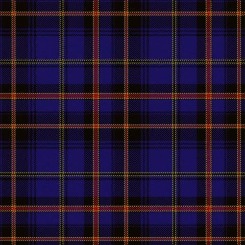
    Critique my tartan design. what do you think ?

    i was bored and could not sleep last night. so i started messing about with one of the tartan designer on a website and this was what i came up with. so what do you all think.
    the colors are based on the team colors for Real Salt lake (look at my user pic)
    and when i have the extra money i would like to get something like this wove for my family to use.
    most of the colors are obvious,
    but the white is for the teams away kit,
    the yellow/gold is for the teams 3rd kit,
    the green can be for the pitch at Rio Tinto Stadium or for the green kits the team wears when they have a game on earthday.
    and the black is for Nick Rimando, the teams goal keeper,

    so if you dont like it say so. i am not one to take offence to someones feelings and can handle criticism

  2. #2
    Join Date
    6th July 06
    Location
    Oxfordshire, England
    Posts
    242
    Mentioned
    0 Post(s)
    Tagged
    0 Thread(s)
    I really like it. I am sure it would make up into a very smart dressy kilt.

    Well done!

    Bob

  3. #3
    Join Date
    11th January 09
    Location
    North Ridgeville, Ohio
    Posts
    836
    Mentioned
    0 Post(s)
    Tagged
    0 Thread(s)
    Very colorful I like it.
    Santa Kona
    Founder & Chairman of Clan Claus Society
    Chieftain Clan Kennedy

  4. #4
    Join Date
    16th September 09
    Location
    Toronto, Canada
    Posts
    3,979
    Mentioned
    1 Post(s)
    Tagged
    0 Thread(s)
    At first look, it's quite nice. After looking in closer detail, I can try to make a suggestion. It looks a bit too busy to my eye because there are a number of smaller lines of the same or near the same thickness. Try mixing up the size of the lines to get the design to come together more.
    - Justitia et fortitudo invincibilia sunt
    - An t'arm breac dearg

  5. #5
    Join Date
    26th May 11
    Location
    west jordan, Ut
    Posts
    205
    Mentioned
    0 Post(s)
    Tagged
    0 Thread(s)
    Quote Originally Posted by CMcG View Post
    At first look, it's quite nice. After looking in closer detail, I can try to make a suggestion. It looks a bit too busy to my eye because there are a number of smaller lines of the same or near the same thickness. Try mixing up the size of the lines to get the design to come together more.
    i agree with it being to busy, if i ever get it wove i will get a pro to chang a few things i dont like. the program on the site i was using was mirroring everything and i was not to concerned with changing that at 2am

  6. #6
    Join Date
    26th May 11
    Location
    west jordan, Ut
    Posts
    205
    Mentioned
    0 Post(s)
    Tagged
    0 Thread(s)
    here is one i did about three months ago, after seeing them both i like this one better

  7. #7
    Join Date
    19th May 08
    Location
    Oceanside CA
    Posts
    3,491
    Mentioned
    0 Post(s)
    Tagged
    0 Thread(s)
    Quote Originally Posted by R.S.L. Kiltwearer View Post
    here is one i did about three months ago, after seeing them both i like this one better
    I could be mistaken, but this one appears to be asymmetrical. Nothing inherently wrong with that (see "Maple Leaf") but it can lead to some challenges when having it woven and made up. I do like your color combo overall.
    Proudly Duncan [maternal], MacDonald and MacDaniel [paternal].

  8. #8
    Join Date
    10th June 10
    Location
    USA
    Posts
    1,093
    Mentioned
    0 Post(s)
    Tagged
    0 Thread(s)
    I agree with Mike Oettle and find the first one more attractive; though CMcG's advice to vary the width of the red and yellow lines a bit would, in my opinion, improve the design.

Similar Threads

  1. A new tartan design
    By G_W in forum The Tartan Place
    Replies: 20
    Last Post: 5th April 11, 09:39 PM
  2. Critique My Tartan Please
    By HamishTheBlack in forum The Tartan Place
    Replies: 14
    Last Post: 29th January 10, 12:09 AM

Bookmarks

Posting Permissions

  • You may not post new threads
  • You may not post replies
  • You may not post attachments
  • You may not edit your posts
  •  

» Log in

User Name:

Password:

Not a member yet?
Register Now!
Powered by vBadvanced CMPS v4.2.0